Google Updates Its 'G' Logo For The First Time in 10 Years
The change is subtle, but the new blended logo brings it in line with the gradient the company uses for the Gemini logo’s design.
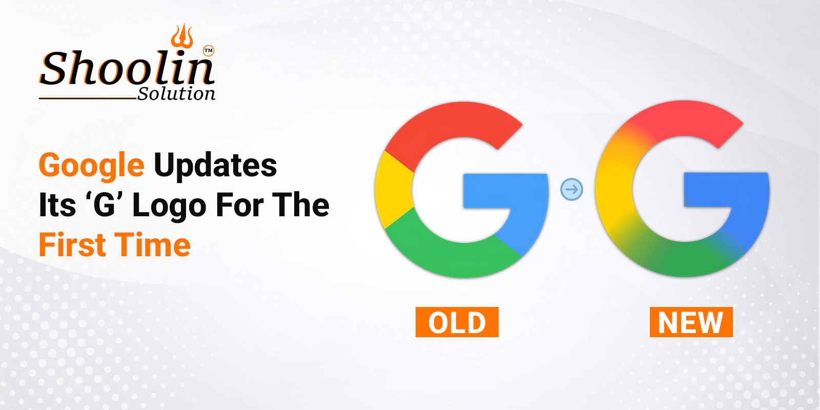
After almost 10 years, Google has unveiled a redesigned version of its iconic ‘G’ logo. The new design moves away from the solid four-colour blocks. Instead, it blends the logo’s colours – red, yellow, green and blue – into a gradient, making it look more vibrant and colourful. The change is subtle, but the new blended logo brings it in line with the gradient the company uses for the Gemini logo’s design. So far, the new, redesigned logo appears only on updated iOS and Pixel phones, the Verge reported.
According to the outlet, Google updated its logo for the first time in almost a decade. The firm last made a major change to its logo in September 2015, when it updated its font to a sans-serif typeface. At the time, Google also unveiled a new ‘G’ logo that incorporates all of the brand’s colours.
Google has not yet made changes to the main Google wordmark. There is also no official confirmation on whether other product logos will undergo similar updates. The “G” still appears with distinct borders between colours on the web and other Android devices.
Meanwhile, internet users were quick to react to the new logo. While some users called the logo “good looking”, others said that they could hardly see any difference.
Source : https://www.ndtv.com/feature/google-updates-its-g-logo-for-the-first-time-in-10-years-internet-has-mixed-reactions-8402048